Monday 24 April 2017

COP 3 Research Proposal

Identified a question that I can take forward to inform my reading for the dissertation.

Question 1: What is Good? - To what extent does Social Responsibility impact on the role and function of Graphic Design?

Social Responsibility 

Sustainability
Advertising


Underrepresentation?

'To what extent do Technological developments in production and distribution impact on Graphic Design?'

There is potential to pursue my interest in traditional printing technology/methods and explore the impact they have on consumerism.

Compare analogue and digital 

Analogue - Tangible, timeless, distribution of information to the masses, aesthetically pleasing, Ltd edition, sensory, process, materials
Process - Made with the hand

Digital - High res and responsive screens, interactive,

Music - Playlist culture


To what extent have traditional print aesthetics impacted contemporary graphic design?


To what extent does Aesthetic ‘Style’ reflect the context, audience and/or function of contemporary Graphic Design?


Explore the aesthetic qualities of traditional printing processes


Ellen Lupton & J. Abbott Miller (1996) - "Design, writing, research: Writing on graphic design"


COP Evaluation

Reading through the research project, I know that it is not a true reflection of my potential as I really struggled with identifying a question. I think this is due to the lack of contextual knowledge about design which lead to indecision and a lack of confidence. My research came from a range of sources; internet, essays, books and editorial however I struggled with identifying facts from texts which lead to longwinded points that kept repeating themselves. I have identified this as something that I need to work for COP 3. An interest in the topic of experimentation lead me to topics such as objectivity and subjectivity which was interesting, however I found it hard to apply the approach to an essay where I had to triangulate, as well as come up with a practical outcome. Having struggled with academic writing in the past, I went to Student Support where I had a talk with a tutor. I found this useful, however gaining a lot of different perspectives from peer feedback, tutors and student support was overwhelming at such a late stage in the project which held me back. A positive that I can take away from this is that I was proactive, however I need to plan ahead in order to imbed my feedback more objectively. The topic of authorship was also very hard to research and apply to an essay because the term itself has doubts as to its legitimacy in design, however I made sure that I noted this in my conclusion, 'design as well as authorship is in constant flux'. Looking forward to the COP 3, I aim to make sure that I choose a question that I am passionate and has relevant sources of theory and context. The lack of time management and changing my research question at such a later stage meant I fell behind on all areas of the module which is evident through my submission. The broadness of my research meant I found it hard to find a focus. Researching the topics, I found understanding the texts really challenging which had a detrimental impact of my confidence. I don't want this to happen next year for my dissertation so I intend to nail a topic and a question as early as possible so that I have time to research and gain an in depth understanding to create relevant arguments. Due to poor time management, my practical response was rushed and I discovered more potential for my research project however I didn't have enough time to work this into the current essay draft.


Practical Response - Design Boards


Practical Response - Feedback

Asked for feedback based on my exhibition concept. I didn't pitch the other concepts, I just showed them the initial sketches, because after further consideration I believe they don't respond to my research project effectively. I gathered feedback from students and also asked a working professional on his thoughts.

Design Students

The crit group thought that the exhibition would provide a great opportunity for students to practice the skills that they have learnt and take ownership of the content. It was identified however that the briefs we already receive allow us to take ownership of our work because they are flexible enough to approach the brief from an angle of interest. That being said, it would be a great opportunity to gain exposure. One member of the crit group identified that my initial concepts for the stamp could be imbedded into the exhibition branding which is something I aim to imbed in order to create consistency in range and distribution of the exhibition.


Russel - ExtraStrong

I managed to get in contact with Russel who currently works for ExtraStrong as a graphic designer. Russel has worked freelance in the past and collaboratively with ExtraStrong therefor I can gain valuable feedback.

Russel thought the proposition for an exhibition was positive for graphic design because designers are more than just service providers. He explained the frustrations of working for clients and there lack of knowledge on design principles and aesthetics. That being said, Russel strongly believes that the main priority for graphic designers is to fulfil the clients needs. The exhibition would allow designers a 'break' from graphic designers as service providers which he believed to be 'healthy' for the designers mind. Russel liked the fact that the exhibition provided the opportunity for designers to work independently. A problem that Russel identified was the fact that providing designers with a brief for the exhibition reverts back to the issue of working for a clients brief. Therefor I intend to leave the exhibition brief as free and broad as possible so that the contributors can interpret it for themselves and explore a subject that interests them.


Practical Response - Development

STAMP

Previous design:


Reworked the stamp so that it is legible on a small scale by increasing the stroke width of the rings and replacing the small text with a bold sign for gold. Hopefully with the theme of the exhibition being 'authorship' the audience will interpret the 'Au' within that sense. 

The Logo/stamp/sticker - Symbolises the designers desire for recognition and commitment to independent design authorship.


Poster Research

Rick Poynor - 'The poster, more than any other form of graphic design practice, has always been poised at the interface between design and art.' - Informed my research into poster design:

Laura Jouan


Limited information and more interest in aesthetic value. This provides evidence that Jouan is an aesthete suited to conceptual design.

Tate, Alexander Calder Exhibition poster:


Tate, Painting in the Sixties


All other the contemporary examples use limited information which can inform my posters.

Limited information
Minimalist graphics
Contemporary

Slightly abstracted letterforms and shapes is evidence of contemporary, artistic design being appropriate for exhibition branding. 


Concept Development

One of the points from my research project was that graphic designers are problem solvers. In order to draw attention to the exhibition and imbed my findings from the research project, I intend to create 'cheesy' and playful problem solver as a witty remark to the designer solely being a problem solver. I aim to keep the problems predominantly visual so that the recipients can interact with it.

Maze:


Nine dots four lines:


These can go on the back of the call for submission leaflets and posters. These can even be distributed in poster form around cities with poster boards as this will encourage the public to get involved and raise awareness of the exhibition. This will be beneficial to the graphic design scene who are rarely recognised for there contributions to contemporary culture.

Proposed Call for entries poster:

Front and back:


Instead of using the problem solving puzzles, I resorted back to the previous concept of using verbs that describe the active role of a graphic designer. This will appear friendly and show a consideration for the role. I added the stamp to the bottom corner to make it familiar and recognisable.

Format: A4
Materials: Pink fluorescent stock
Processes: Ink jet printer keeps the cost to a minimum. The posters can also be screen printed which would provide opportunity to foil the 'Au' stamp.
Distribution: Posted/delivered to design studios and universities to get a broad demographic
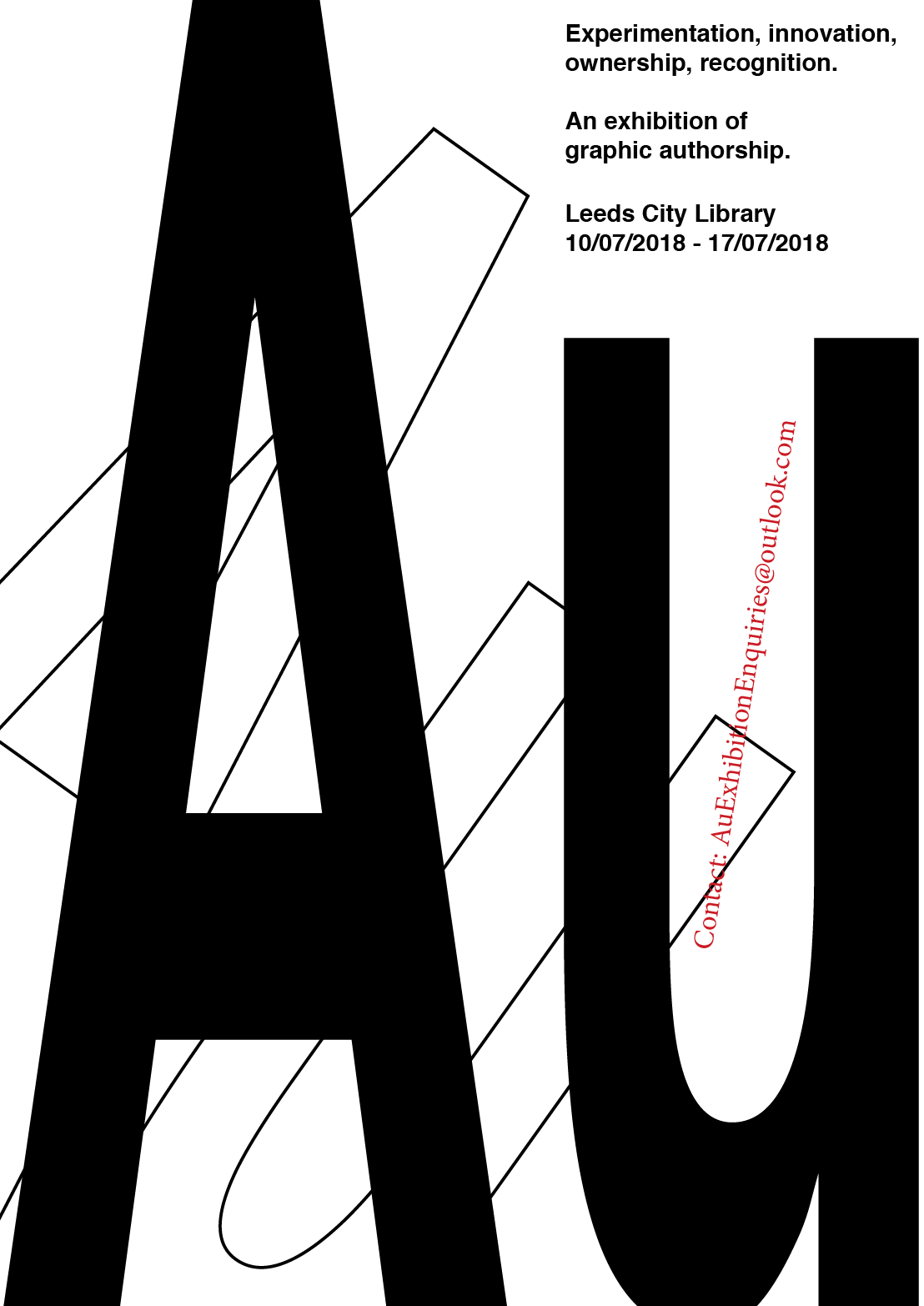

Exhibition poster:


Format: A3 and A2

Materials:Pink, green and yellow fluorescent stock to draw attention to it. Inspired by the posters from the streets of Berlin.

Processes: Digital print

Distribution: As the target audience are culturally engaged I aim to focus the distribution to locations where they are most likely to be exposed to the exhibition. Focus on Leeds for example:
  • Belgrave 
  • Headrow House
  • Old Red Bus Station 
  • Leeds Gallery
  • Henry Moore Institute
  • Museums
  • Theatre
  • Village Bookstore
  • Colours May Vary
  • The Tetley
  • The posters can be pasted on the various totem poles that are scattered around the city. 
This can be transferred to cities and locations all over the UK.

Design Universities - Posters distributed to art and design Universities will increase awareness and spark interest.

Promotional Flyers:

Altered the previous idea to encourage the public to interact with the fly posters.


Distribution:

A5 flyers - 200gsm stock
A3 and A1 - 100gsm stock


Practical Response - 'Call for Entries' Poster Research and Idea Generation

Researched into posters that call for submissions to inspire the content and composition.

Kolob Canyon Review


I like how limited the information is on the poster because simply stating the genres involved in the event immediately inform 

Patrik Svensson

Find the illustration below inspiring because the hand is peeling away to reveal the content. This illustrates the designers anonymity being removed by the fact that the exhibition provides opportunity for recognition. 


Graphic Dialog by Tom Hornby

Contemporary design that obscures the message but intrigues its audience. Again the informative information is displayed small to give further authority to the abstract typography. 


Call for entries poster designed by Marnich for DeTnk:


Again a very contemporary example which has been folded - Perhaps for easier distribution purposes.

Dafi Kuhne - Typographic Summer Program - Apply Now!


Kuhne has enlarged the statement 'Death to the print' as the main focal point. The controversy of the statement intrigues the viewer to look closer. Further information is less prominent however the poster will draw in its demographic from the statement.


Distribution:

In terms of distributing the call for entries, I propose a flyer that can be sent out to design studios, universities and cultural institutions. This will allow subjects to take away the information and increase the likelihood of them submitting.

Instead of a flyer, I could send a folded poster to create more of an impact.


Graphic Design, Exhibition Context, Curatorial Practices 

Provides a list of galleries, exhibition spaces and events which provide context for exhibitions and curatorial projects of/about graphic design and involving graphic designers. This can help to inform the exhibition branding elements because they are institutions that include graphic design in an exhibition context.

– Design Museum, London, UK
– Eastside Projects, Birmingham, UK
http://www.eastsideprojects.org
– Kemistry Gallery, London, UK
http://kemistrygallery.co.uk
– KK Outlet, London, UK
http://www.kkoutlet.com

Exhibition Name
The title of the exhibition: 'Au' developed as a response to my essay question as I found a lot of essays and texts about authorship described designers as prestigious characters. When looking at the definition for the word 'author' I noticed that there are many prestigious words beginning with the letters 'Au':
Author
Authorship
Authority
Authoritarian
Autonomous
Authoritative
Audacity
Au = Gold on the periodic table
Autobiography
A lot of the words refer to the power and position of an individual which relates nicely to my concept because I am aiming to portray the designer as a powerful role. Other words such as 'autonomous' and 'audacity' can refer to the natural ways in which designers think but commercial realities prevent them from putting them into action. The fact that 'Au' is gold in the periodic table adds to the prestigious position that I want to make more people aware of. Finally, 'Au' can be interpreted as a greeting or attracting someone's attention, 'Ey You!'. There are many ways in which the title can be interpreted and this ambiguity reflects the merky world of graphic authorship. 

INITIAL SKETCHES
Content required on the poster:
Definition/Theme of the exhibition - Authorship
What I am asking the designers to do.
Deadline for submission
Submit to.. Email
Sketched out some initial ideas in order to gain a better understanding of the compositional elements, as well as the tone of voice. Setting 'call for entries' in capitals to draw the audiences eye and capture their attention. This was inspired by Kuhne's poster for his Typographic Summer Program. Other renditions were inspired by the periodic table:


Perhaps the periodic table graphic for gold can help to inform the exhibition logo.

Moved onto using statements to speak directly to the designers. The statements recognise the work that designers do and encourage them to take part in the exhibition to gain some credit but also exercise their technical and conceptual skills:


Top right of the image


Listing the characteristics of graphic designers to create familiarity and also consideration. I also imbedded some humour to seem friendly and more human. 

Bottom right was inspired by my previous research. The type is very small yet a large question mark fills the centre of the composition which, as the character itself suggests, creates confusion and intrigues. The small 'flap' of paper that has been peeled away reveals the title of the exhibition. I really like the simplicity of the composition and how its interpretation creates curiosity.
Based on these sketches, I moved onto InDesign to digitally mock up the concepts with more accuracy and start considering design elements such as typography and colour. 

Formal Response:
The logo looks very formal and unintentionally imitates the Adobe software logos therefor it needs changing. Provided an overall explanation of the exhibition to provide designers with further context of what the exhibition is about. However, by offering them suggestions on how they can approach the brief could in fact influence their interpretation and therefor there outcomes wont be examples of authorship. 

Contemporary approach
Limited the information:


Combining the previous two concepts and layering the title of the exhibition over the top of the verbs:


The verbs are illegible therefor I propose a double sided poster:

Front:

Back:


The minimalist style aims not to influence the designers interpretation of the exhibition brief, however I am aware that the lack of information about the context of the exhibition will lead to confusion. The email address provided will encourage designers to enquire about the exhibition, showing an interest, and therefor they will receive further information such as:

'Graphic designers are problem solvers, service providers to fulfil a clients needs, however ‘Au’ is an opportunity for you to gain recognition for your impact on contemporary culture.

The concept is completely up to you, however the work needs to be personal to you and your specific practice. You can take influence on your position as a designer, frustrations with the industry or explore a topic of your interest.

The exhibition is all about removing yourself from commercial realities and taking complete ownership over your work in order for you to achieve graphic authorship and recognition.'

Practical Response - Exhibition Branding

Aim to create an identity for the exhibition in relation to my research project. The exhibition name evolved as the result of my research into traditional definitions 'author' which carried authoritative connotations. From my essay I established that, although authorship may not be a legitimate theory, the designer needs to carry authority and a reputation in order to be recognised. Therefor 'Au', meaning gold in the periodic table, promotes legitimacy, courage, wealth and prosperity which is desirable.

Based my sketches on the periodic table:


Helvetica was influenced by my research into Modernist design principles. The typeface was relied upon in order to achieve consistency and neutrality, therefor it is appropriate for my logo because it is highly legible on a range of scales but most of all it creates a neutral tone of voice. This is important because I do not want to influence the contributors response to the exhibition brief.


Stretched the form vertically in order create more authority:


Decided against experimenting with gold because the outcome would be printed using a laser printer to save costs and from previous experience gold looks more like a mustard brown. If I was to take this further into production, I would consider foiling the logo in order to achieve a professional standard.

Sarris proposes three premise for the theory of auteur to which he visualises through a circular diagram:


'According to Sarris, (Notes on The Auteur Theory in 1962) for a film director to become an auteur they must meet three criteria: ‘First premise is the technical competence of a director as a criterion of value. Second premise of auteur theory is the distinguishable personality of the director. Third premise is concerned with interior meaning.’


He also proposes that there is no prescribed course as to how the director (designer) passes through these three circles due to the fact that the role differs depending on the task at hand; 'a technician, a stylist and an auteur'.

This can inform the stamp or the exhibition branding so I mocked up a potential logo keeping simple but contemporary.