Written Investigation:
Over the summer I dedicated my reading to the notion of Authorship within graphic design. Books such as 'Designer As...' by McCarthy lead me to discover Emigre magazine which I have found really inspiring. Whilst I was gaining a better understanding of the motives for graphic designers to seek authorship, I came across artists' books. I became inspired by the unconventional uses of the book that push principles of design and editorial. At times it was challenging to research a new topic whilst writing the dissertation. This was made harder by the ambiguity that surrounds the definition of the artists' book, making it hard to concentrate on a specific area. Before researching into the artists' book, my perception was that they were more like coffee table books; glossy, expensive and oversized. However, Philpott's diagram helped me to get my head around the complicated subject which allowed me to concentrate my research question. The lack of theory within publishing in general has made it challenging to provide arguments for the impact of the artist book, however the knowledge I gained through exploring the notion of publishing as artistic practice suggests that there are new boundaries to explore that could help determine some critical theory within publishing.
Struggled to make an argument out of my findings, therefore it turned into more of a research project. Often the more I read, the more elusive the genre of the artists' book seemed to be. The limited word count meant that I limited the exploration within my essay, which was a shame considering the broad research I carried out. I feel if the word limit was larger I could have found a better structure.
Practical Investigation:
My practical investigation could have gone into more depth, particularly if I'd looked at innovative methods of publishing online, instead of just simply using ISSUU. I feel that online publishing is yet to be developed. It would have been interesting to explore the limitations of print and show how digital tools overcome these limitations. However, showing a greater attention to the book as form allowed me to emphasise the importance of the printed book. If I had started the research for my practical investigation earlier, this could have strengthened my essay a lot more as the link between my written and practical piece is tangible.
Monday 22 January 2018
Final Practical Outcomes
Publishing my artists' book through digital outlets such as ISSUU ultimately increases exposure and availability. Whilst the aesthetic experience of the book is limited through screen, the digitisation of the book allows its memory to live on as a digital archive. This reflects the symbiotic relationship between publishers and the artists' book.
Publishing through Print

Variety of different stock weights, colours and textures have been informed by the process of making the book. The main purpose of publishing through print is to stimulate sensory experiences such as the feel, smell and action of turning the page. The professional quality of the design and production allows it to be viable for sale in independent bookstores.
PDF Print Out / Download

Explored further by making a GIF out of it for social media.
https://www.instagram.com/p/BeBVE61H-83/?taken-by=jwgreengd
YouTube:
This has been linked to my own personal website evidencing the benefit of increased communications through the WWW.
Synthesis
My decision to create an artists' book was influenced by Ulises Carrion's 'The New Art of Making Book's. I decided to adopt the role of artists and publisher in order to explore production and distribution methods available.
My research into Dieter Roth informed me that in order to be classed as an artists’ book it is required to be printed in multiples. Originally a writer, Roth created books as a means to publish his work, using cheap materials and print making techniques. What makes Roth such an influential part of the rise of the artist book was the fact that he challenged common trade in the art market. Instead of creating singular pieces of art, Roth’s practice encouraged editions, multiples and prints. He stated ‘Power = Quantity’ as he realised that the success of magazines and newspapers wasn’t conveying the news or information, but rather selling as many copies as they could. For Roth, the multiple allowed him to make a living as he was able to send them out into the world, taking advantage of the printed format to gain exposure and a broader audience. Clive Phillpot also supports this, believing artists’ books should be printed in multiples since unique works ‘normally embody a denial of the potential replicability of content and the inherent communicative value of the printed book’ (Phillpot, 2012).
Used the book as an 'autonomous space' which allowed me to flex my current knowledge and skills in design. Not only did this give me the freedom to act independently but it also allowed me to formalise elements of the book, such as typesetting, to make the book more commercially viable. As highlighted within my conclusion, there is still more attention to the book as physical form therefore I alternated the stock, medium and page sizes to highlight the experiential nature of the printed book.
This backs up my conclusion that graphic designers are using publishing to explore personal projects in the same way that artists are using the book as an alternative space to the exhibition context.
In order to communicate the symbiotic relationship between artists books and publishing, I used a variety of publishing formats. The the experiential and tangible nature of the book as form which will be published using professional printers and considered stock. The professional quality of production makes it commercially viable to be sold in independent book shops and artist book fairs such as Off Print London. The publication has also been published online to reflect how artists' are taking advantage of new technologies such as digital publishing and the World Wide Web to reach a broader audience. Furthermore, this reflects how online sources is helping to archive limited edition and out of print books so there memory lives on. Influenced by Antoine Lefebvre's research project 'La Bibliotheque Fantastique' and DR.ME's 'FIN?' the book is also available online as a PDF to print at home on any standard printer. The publication is available in colour and black and white to suit old and new printers. Whilst the quality of production may be challenged by the users printer, the primary purpose of the PDF is to get artwork into the hands of the public.
'In the old art the writer judges himself as being not responsible for the real book. He writes the text.
The rest is done by the servants, the artisans, the workers, the others.
In the new art writing a text is only the first link in the chain going from the writer to the reader. In the
new art the writer assumes the responsibility for the whole process.'
Artists who decide to use commercial presses to mass produce their work are faced with economic challenges as a result of the high production costs and low retail price, combined with a lack of commercial interest, barely allowing the artists to make any profit. My outcome ultimately challenges this by having a digital edition of the book available online for free. Although the experience is lost within digital, it still allows people to access the artwork.
My research into Dieter Roth informed me that in order to be classed as an artists’ book it is required to be printed in multiples. Originally a writer, Roth created books as a means to publish his work, using cheap materials and print making techniques. What makes Roth such an influential part of the rise of the artist book was the fact that he challenged common trade in the art market. Instead of creating singular pieces of art, Roth’s practice encouraged editions, multiples and prints. He stated ‘Power = Quantity’ as he realised that the success of magazines and newspapers wasn’t conveying the news or information, but rather selling as many copies as they could. For Roth, the multiple allowed him to make a living as he was able to send them out into the world, taking advantage of the printed format to gain exposure and a broader audience. Clive Phillpot also supports this, believing artists’ books should be printed in multiples since unique works ‘normally embody a denial of the potential replicability of content and the inherent communicative value of the printed book’ (Phillpot, 2012).
This knowledge ultimately encouraged me to explore methods of reproduction through digital tools such as the photocopier, scanner and Adobe creative suit. This demonstrates how manual and digital processes can feed off each other. My decision to create an artists' book was influenced by the need to share my interpretation through form and content. I am not only preparing my own artwork for reproduction and dissemination but also the work of Ulises Carrion and W. H. Auden.
My knowledge gained from looking at the rise of the artists' book fair lead me to take greater attention to the book in physical form. In the same way that artists' and designers such as Roth and Lissitzky responded to poetry and literature, I used Carrion's 'New Art of Making Books' to provide the content of the book and responded to it using a variety of techniques and processes. In order to communicate this, I used manual processes such as painting, collage and mark-making techniques. My interpretation was particularly influenced by Carrion's emphasis on 'Space'; 'A book is a sequence of spaces'. This influenced me to look at the structure of typesetting to which I abstracted through painting. With greater attention to the book as form, the book must reflect process. To achieve this I bound my original notes, sketches and scans of texts into the book. Not only does this demonstrate process, but also uses cheap methods of production influenced by my research into zines such as Riot Grrrl.
Used the book as an 'autonomous space' which allowed me to flex my current knowledge and skills in design. Not only did this give me the freedom to act independently but it also allowed me to formalise elements of the book, such as typesetting, to make the book more commercially viable. As highlighted within my conclusion, there is still more attention to the book as physical form therefore I alternated the stock, medium and page sizes to highlight the experiential nature of the printed book.
This backs up my conclusion that graphic designers are using publishing to explore personal projects in the same way that artists are using the book as an alternative space to the exhibition context.
In order to communicate the symbiotic relationship between artists books and publishing, I used a variety of publishing formats. The the experiential and tangible nature of the book as form which will be published using professional printers and considered stock. The professional quality of production makes it commercially viable to be sold in independent book shops and artist book fairs such as Off Print London. The publication has also been published online to reflect how artists' are taking advantage of new technologies such as digital publishing and the World Wide Web to reach a broader audience. Furthermore, this reflects how online sources is helping to archive limited edition and out of print books so there memory lives on. Influenced by Antoine Lefebvre's research project 'La Bibliotheque Fantastique' and DR.ME's 'FIN?' the book is also available online as a PDF to print at home on any standard printer. The publication is available in colour and black and white to suit old and new printers. Whilst the quality of production may be challenged by the users printer, the primary purpose of the PDF is to get artwork into the hands of the public.
Saturday 20 January 2018
Practical Investigation - PDF Print/Download
Inspired by the work of Antoine Lefebvre, the publication has been made available to print at home via a PDF download. This ultimately increases accessibility of content, allowing people to experience art outside the exhibition context.
The publications available from Lefebvre's La Bibliotheque Fantastique emulate print as the pages consist of scans from the physical book. This picks up subtle creases in the page and textures of stock as demonstrated by LBF 2 by Joseph Imhauser and Antoine Lefebvre


This informed my decision to use unedited scans of my publication instead of the original InDesign file. This will allow me to capture the imperfections from manual processes in order to emulate the experiential qualities of the printed original.
Professional Consideration
Printers found at home and in offices most commonly print A4 size pages. As the original book requires the double page spreads to be printed on A3, I have scaled the book down to A4. This means once the book is printed and folded it will be A5.
The document can also be printed in colour or black and white. This was also influenced by Lefebvre as it makes the artists' book available to print from old and new printers, ultimately increasing accessibility.
Test printed the book via the PDF available through ISSUU to support my submission:


I simply stapled the book together, however their is opportunity here to provide instructions on how to bind the book using a needle and thread. Perhaps if I was to take this concept further, I would create a site dedicated to print on demand technology so that all of this information could be in one place.
Once the book was bound, I had to trim the pages with a scalpel. Whilst this isn't essential in experiencing the artwork, it can have a detrimental impact on the production quality of print at home technology. As an alternative, the user can buy the printed format from independent bookstores to avoid poor quality.
Overall I am really pleased with the quality of print considering it was printed on standard 90gsm stock from a standard printer. The flakey texture of the recycled stock has been successfully transferred into the PDF, allowing the user to experience the tangibility of the original book through print and digital.
Instead of using ISSUU it would be more beneficial if the book was available through my own publishing site. This would re-enforce the role of the artist as publisher.
Practical Investigation - Production
Size
The publication will be slightly smaller than A4 to allow the double page spreads to be printed on sheets of A3 paper. It is important to make the book as affordable as possible in order to increase chances of making profit.
Stock - The contrasts between stock weight, colour and texture aims to stimulate the reader

Recycled - 135gsm
In order to show an attention to materials and enhance the sensory experience of a book, I invested in some recycled stock from G.F Smith. The flakey off white texture of the stock aims to blend with the imperfections of the paintings. The affordability of the stock also lends itself to be mass produced.
Dark Green - 135gsm
Insert to separate the cover from the content
Grey - 270gsm
Used a higher grade of gsm in order to provide structure to the cover of my publication.
Used grey to communicate digital technology whilst the green communicates the natural autonomy of art.
Standard Photocopy Paper - 90gsm
The low quality of stock and the fact that it is pure white will increase the sensory experience.
Binding
Instead of simply stapling the content together, I decided to saddle stitch it in order to communicate the process of traditional book production and make it more desirable. I chose a dark green thread in order to compliment the grey cover.
Practical Investigation - Design Phase 3
Combining physical and digital elements:
Photocopied my written notes from entire module. I overlapped the notes by feeding the same piece of paper into the copier. This brings in elements from my initial concepts and emphasises the process of coming to this final resolution.

The quality of the standard photocopy stock is fairly low, however this will contrast with a variety of other stocks.
Cover Design
The cover was influenced by directional arrow road markings for drivers:

From observing the arrows on the road, it seems they only work depending on the perspective of the viewer. Drivers approaching the road marking are looking at it from an angle.
I traced the arrow through Illustrator:

Rotating:


The arrow also looks like a manipulated computer cursor. The symbol can be used to communicate a new perspective of the book as it is being challenged by digital and physical outlets. The curvature and perspective of the arrow suggests speed and movement, therefore it would be appropriate to communicate the forward thinking, innovative approach to artists' books.
A lot of traditional book covers explored through La Bibliotheque Fantastique consist of minimal design features.
LBF 0 - Antoine Lefebvre

This is also consistent with the books presented on Printed Matter:

Dog House - Ken Kagami


They seem to let the content do the talking!
Kept the cover minimal:

Used Baskerville to highlight the tradition of the artists' book as evidenced by my research into responses to poetry and literature. The traditional serif typeface also gives Carrion's title more authority. Univers was used to highlight my involvement within the book which is why I contrasted the typefaces through the authors names.
I haven't added any colour as I intend to print directly onto a coloured stock.
Page Compositions
Took advantage of digital design tools by cropping and layering compositions:


This demonstrates the benefits of digital design tools.
Willem Sandberg - Experimenta Typografica
Looked at the work of Willem Sandberg's pamphlet design in order to see how he combines text and image through the pages of the book.
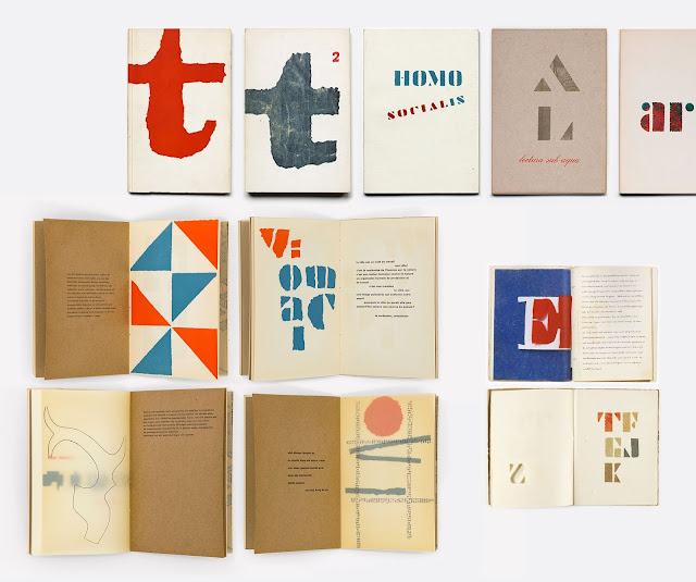
Dynamic use of typography
Separates artwork and copy using the centre fold
Non of the pages are the same
Typesetting is inconsistent
Different stocks


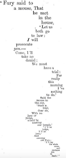
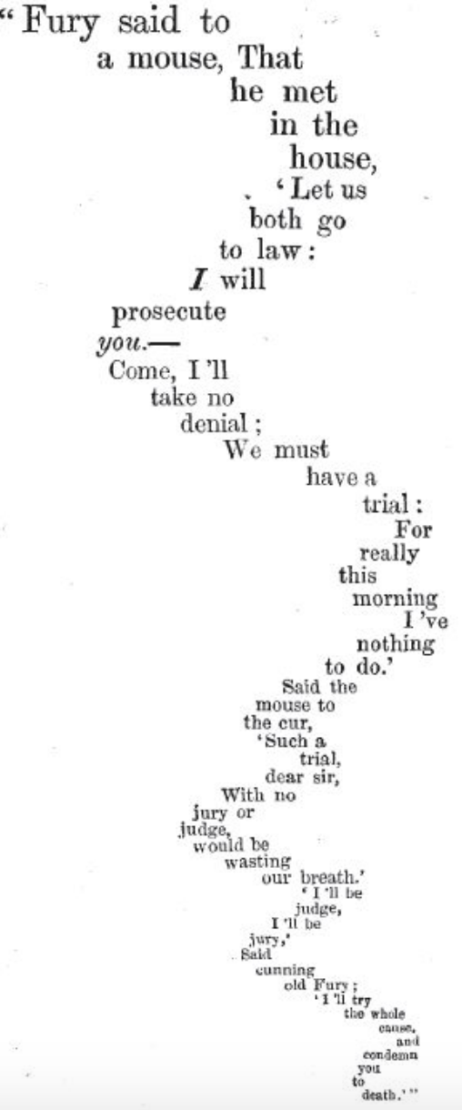
The Unknown Citizen' by W. H. Auden
The fact that the artists' book originates through poetry and literature and Carrion's text provides a section on 'Prose and Poetry', I included a poem at the end of the text in order to demonstrate some of the experimental methods of typesetting that poetry promotes.
I chose to include Auden's 'The Unknown Citizen' because it is renowned for its wit and irony in complaining about the mundane and anonymous qualities of bureaucratic, semi-socialist Western societies. This relates to my research project as I discovered the artists' book was a liberating platform for people to express subconscious and thematic issues without commercial restraints and ultimately become the author of their own work.

The artists' book was also a reaction against the fine art establishment
Graphic designers turned to independent publishing to seek authorship
The painting of the blocks of text aims to emphasise alternative spaces.
Kept the cover minimal:

I haven't added any colour as I intend to print directly onto a coloured stock.
Page Compositions
Took advantage of digital design tools by cropping and layering compositions:


This demonstrates the benefits of digital design tools.
Willem Sandberg - Experimenta Typografica
Looked at the work of Willem Sandberg's pamphlet design in order to see how he combines text and image through the pages of the book.

Dynamic use of typography
Separates artwork and copy using the centre fold
Non of the pages are the same
Typesetting is inconsistent
Different stocks


The Unknown Citizen' by W. H. Auden
The fact that the artists' book originates through poetry and literature and Carrion's text provides a section on 'Prose and Poetry', I included a poem at the end of the text in order to demonstrate some of the experimental methods of typesetting that poetry promotes.
I chose to include Auden's 'The Unknown Citizen' because it is renowned for its wit and irony in complaining about the mundane and anonymous qualities of bureaucratic, semi-socialist Western societies. This relates to my research project as I discovered the artists' book was a liberating platform for people to express subconscious and thematic issues without commercial restraints and ultimately become the author of their own work.

The artists' book was also a reaction against the fine art establishment
Graphic designers turned to independent publishing to seek authorship
The painting of the blocks of text aims to emphasise alternative spaces.
Practical Investigation - Crit
I pitched my overarching aims of the research project and highlighted my key findings:
My research question touches on technological advancements such as the Mac, digital printing and the WWW. This ultimately increased communications between artists' and allowed them to take on the role of publishing for themselves. Whilst my initial intention was to create a printed outcome, there is potential to show the symbiotic relationship between artists' and publishers by publishing my artists' book through print and online.
- Emphasis on process
- Availability
- Allowing people to experience art outside the exhibition context
- Symbiotic relationship between the artists' book and publishing
- Symbiotic relationship between print and digital
- Graphic design is ultimately increasing standard and reputation
My crit group was predominantly UX designers which gave me a new perspective of the impact technology is having on the development of user interaction.
My research question touches on technological advancements such as the Mac, digital printing and the WWW. This ultimately increased communications between artists' and allowed them to take on the role of publishing for themselves. Whilst my initial intention was to create a printed outcome, there is potential to show the symbiotic relationship between artists' and publishers by publishing my artists' book through print and online.
Practical Investigation - Design Phase 2
Started to combine text and image digitally. I used my interpretation of the text and translated these through paint and other mediums to accommodate the text.
What a book is
'A book is a space-time sequence'
'A book is a sequence of spaces'
'Each of these spaces is perceived at a different moment - a book is also a sequence of moments.'
Focus on 'sequence':
Repeat pattern?
Order
Repetition
'But books, seen as autonomous realities, can contain any (written) language, not only literary language, or even any other system of signs'
- Opportunity to deform type
'In the new art the writer assumes responsibility for the whole process'
'In the old art the writer writes the text. In the new art the writer makes books.'
Photocopies
Hand written type using paint brush/ink
Shape and type

Prose and Poetry
'There will also always be people who like playing chess, gossiping, dancing the mambo, or eating strawberries with cream.'
Layering type over the paintings creates more engaging page compositions. I am aware that this may have a detrimental impact on the reading experience, however it highlights how the traditional manifestation of the book can be challenged - 'Verses ending halfway on the page, verses having a wider or a narrower margin, verses being separated from the following one by a bigger or smaller space - all this is exploitation of space.'

Combining physical and digital:


Introduced Baskerville Bold so that the publication contains traditional and contemporary typefaces.
Made sure non of the pages were the same in order to avoid creating a 'boring book' - 'A book of 500 pages, or of 100 pages, or even of 25, wherein all the pages are similar, is a boring book considered as a book, no matter how thrilling the content of the words of the text printed on the pages might be.' (Carrion)
Didn't edit the scanned paintings apart from using the MagicWand tool on Photoshop to simply delete the background. Apart from this, I kept all imperfections to keep an honest representation of manual processes.
Working digitally with the paintings was a really enjoyable experience as the inconsistent textures of the paint are complimentary with the formal typography. This was a really useful way for introducing colour to my publication. Whilst it would have been nicer if I had the original paintings inside the original book, this process shows how digital and physical media can work together in harmony.
What a book is
'A book is a space-time sequence'
'A book is a sequence of spaces'
'Each of these spaces is perceived at a different moment - a book is also a sequence of moments.'
Focus on 'sequence':
Repeat pattern?
Order
Repetition
'But books, seen as autonomous realities, can contain any (written) language, not only literary language, or even any other system of signs'
- Opportunity to deform type
'In the new art the writer assumes responsibility for the whole process'
'In the old art the writer writes the text. In the new art the writer makes books.'
Photocopies
Hand written type using paint brush/ink
Shape and type

Prose and Poetry
'There will also always be people who like playing chess, gossiping, dancing the mambo, or eating strawberries with cream.'
Layering type over the paintings creates more engaging page compositions. I am aware that this may have a detrimental impact on the reading experience, however it highlights how the traditional manifestation of the book can be challenged - 'Verses ending halfway on the page, verses having a wider or a narrower margin, verses being separated from the following one by a bigger or smaller space - all this is exploitation of space.'

Combining physical and digital:


Made sure non of the pages were the same in order to avoid creating a 'boring book' - 'A book of 500 pages, or of 100 pages, or even of 25, wherein all the pages are similar, is a boring book considered as a book, no matter how thrilling the content of the words of the text printed on the pages might be.' (Carrion)
Didn't edit the scanned paintings apart from using the MagicWand tool on Photoshop to simply delete the background. Apart from this, I kept all imperfections to keep an honest representation of manual processes.
Working digitally with the paintings was a really enjoyable experience as the inconsistent textures of the paint are complimentary with the formal typography. This was a really useful way for introducing colour to my publication. Whilst it would have been nicer if I had the original paintings inside the original book, this process shows how digital and physical media can work together in harmony.
Practical Investigation #2 - Crit/Feedback 9/1/18
Showed examples of artists' books by passing around 21st Century Artists' Books to overcome the lack of understanding that followed the last crit.
Feedback

Find some poems and trace structure and space
Sketch out some compositions
Start painting
Feedback
Do you think the columns are too narrow?

- Group said they like the narrow columns as it opens up a lot of white space, however I need to avoid orphans.
I enquired about whether I should integrate the text into the artwork:
- Group agreed I should clearly lay out the text and then respond to it through the following pages. This aims to give the user more context about the work and increase understanding. This will overcome limitations of the artists’ book such as lack of understanding of the books/artists’ intent.
- However they said they would like to see some experimental typesetting on a few pages when necessary.
Plan of action
Find some poems and trace structure and space
Sketch out some compositions
Start painting
Practical Investigation - Visual Interpretation of Ulises Carrion's 'The New Art of Making Books'
Referred to Ulises Carrion's essay in search for key quotes I can use for visual inspiration.
What a book is
'A book can exist as an autonomous and self-sufficient form, including perhaps a text that emphasises that form, a text that is an organic part of that form: here begins the new art of making books.'
'In the old art the writer judges himself as being not responsible for the real book. He writes the text. The rest is done by the servants, the artisans, the workers, the others. In the new art writing a text is only the first link in the chain going from the writer to the reader. In the new art the writer assumes the responsibility for the whole process.'
Prose and Poetry
'In the new art every page is different; every page is an individualized element of a structure (the book) wherein it has a particular function to fulfil.'
'A book of poems contains as many words as, or more than, a novel, but it uses ultimately the real, physical space whereon these words appear, in a more intentional, more evident, deeper way.'
'This is so because in order to transcribe poetical language onto paper it is necessary to translate typographically the conventions proper to poetic language.'
'There are still, and always will be, people who like reading novels. There will also always be people who like playing chess, gossiping, dancing the mambo, or eating strawberries with cream.'
The Space
'The introduction of space into poetry (or rather of poetry into space) is an enormous event of literally incalculable consequences. One of these consequences is concrete and/or visual poetry. Its birth is not an extravagant event in the history of literature, but the natural, unavoidable development of the spatial reality gained by language since the moment writing was invented.'
'In the new art (of which concrete poetry is only an example) communication is still inter-subjective, but it occurs in a concrete, real, physical space - the page'
'If two subjects communicate in the space, then space is an element of this communication. Space modifies this communication. Space imposes its own laws on this communication.'
The Language
'The words in a new book might be the author's own words or someone else's words. A writer of the new art writes very little or does not write at all.'
Structures
'In a book of the old art words transmit the author's intention. That's why he chooses them carefully. In a book of the new art words don't transmit any intention; they're used to form a text which is an element of a book, and it is this book, as a totality, that transmits the author's intention.'
The Reading
'In the old art all books are read in the same way.
In the new art every book requires a different reading.'
'In the old art, to read the last page takes as much time as to read the first one. In the new art the reading rhythm changes, quickens, speeds up.'
'In the new art you often do NOT need to read the whole book. The reading may stop at the very moment you have understood the total structure of the book,'
Initial Response
'A book of poems contains as many words as, or more than, a novel, but it uses ultimately the real, physical space whereon these words appear, in a more intentional, more evident, deeper way.'
'This is so because in order to transcribe poetical language onto paper it is necessary to translate typographically the conventions proper to poetic language.'
Sketches inspired by outlining blocks of typography from poems. Abstracted the shapes by making them more curvaceous.


Materials: Gouache Paint
Used gouache paints influenced by the fact that it is a historical medium within fine art. Using paint also reflects the craft orientated approaches for the creation of content before digital tools were available. I have noted that contemporary artists' book publishers such as NewLight Press are still using traditional techniques such as print and painting in order to emulate the printed book through screen.
The fact that the artists' book is an autonomous space where the artist can act independently, I didn't overthink compositions and colour schemes in order to gain more expressive results.


'A book is a sequence of spaces' - Created a sequence from simple mark making techniques:


Responded more expressively in order to create raw textures and colour combinations:

Photocopier:
Communicating the physical process of making and experiencing the book through photocopying. This was inspired by exploring DIY methods of publishing such as zines. I photocopied my hand in a variety of positions to emulate touching or picking something up. This communicates the manual process of reading a book.


Review
I intend to take these scans into digital production methods such as InDesign in order to see how I can incorporate them into the sequential nature of the book.
What a book is
'A book can exist as an autonomous and self-sufficient form, including perhaps a text that emphasises that form, a text that is an organic part of that form: here begins the new art of making books.'
'In the old art the writer judges himself as being not responsible for the real book. He writes the text. The rest is done by the servants, the artisans, the workers, the others. In the new art writing a text is only the first link in the chain going from the writer to the reader. In the new art the writer assumes the responsibility for the whole process.'
Prose and Poetry
'In the new art every page is different; every page is an individualized element of a structure (the book) wherein it has a particular function to fulfil.'
'A book of poems contains as many words as, or more than, a novel, but it uses ultimately the real, physical space whereon these words appear, in a more intentional, more evident, deeper way.'
'This is so because in order to transcribe poetical language onto paper it is necessary to translate typographically the conventions proper to poetic language.'
'There are still, and always will be, people who like reading novels. There will also always be people who like playing chess, gossiping, dancing the mambo, or eating strawberries with cream.'
The Space
'The introduction of space into poetry (or rather of poetry into space) is an enormous event of literally incalculable consequences. One of these consequences is concrete and/or visual poetry. Its birth is not an extravagant event in the history of literature, but the natural, unavoidable development of the spatial reality gained by language since the moment writing was invented.'
'In the new art (of which concrete poetry is only an example) communication is still inter-subjective, but it occurs in a concrete, real, physical space - the page'
'If two subjects communicate in the space, then space is an element of this communication. Space modifies this communication. Space imposes its own laws on this communication.'
The Language
'The words in a new book might be the author's own words or someone else's words. A writer of the new art writes very little or does not write at all.'
Structures
'In a book of the old art words transmit the author's intention. That's why he chooses them carefully. In a book of the new art words don't transmit any intention; they're used to form a text which is an element of a book, and it is this book, as a totality, that transmits the author's intention.'
The Reading
'In the old art all books are read in the same way.
In the new art every book requires a different reading.'
'In the old art, to read the last page takes as much time as to read the first one. In the new art the reading rhythm changes, quickens, speeds up.'
'In the new art you often do NOT need to read the whole book. The reading may stop at the very moment you have understood the total structure of the book,'
Initial Response
'A book of poems contains as many words as, or more than, a novel, but it uses ultimately the real, physical space whereon these words appear, in a more intentional, more evident, deeper way.'
'This is so because in order to transcribe poetical language onto paper it is necessary to translate typographically the conventions proper to poetic language.'
Sketches inspired by outlining blocks of typography from poems. Abstracted the shapes by making them more curvaceous.


Materials: Gouache Paint
Used gouache paints influenced by the fact that it is a historical medium within fine art. Using paint also reflects the craft orientated approaches for the creation of content before digital tools were available. I have noted that contemporary artists' book publishers such as NewLight Press are still using traditional techniques such as print and painting in order to emulate the printed book through screen.
The fact that the artists' book is an autonomous space where the artist can act independently, I didn't overthink compositions and colour schemes in order to gain more expressive results.


'There will also always be people who like playing chess, gossiping, dancing the mambo, or eating strawberries with cream.':

Painted over original texts. Here I used pages from an Ikea instruction manual to highlight Carrion's variety of languages. I painted over the type to demonstrate how the text is purely an element of the space within a book.

'A book is a sequence of spaces' - Created a sequence from simple mark making techniques:

Created textures using unconventional mark making techniques. This is to highlight the raw, physical qualities within the book. To achieve this, I used an old credit card and dragged the paint down the page:

Responded more expressively in order to create raw textures and colour combinations:

Photocopier:
Communicating the physical process of making and experiencing the book through photocopying. This was inspired by exploring DIY methods of publishing such as zines. I photocopied my hand in a variety of positions to emulate touching or picking something up. This communicates the manual process of reading a book.


Review
I intend to take these scans into digital production methods such as InDesign in order to see how I can incorporate them into the sequential nature of the book.
Subscribe to:
Posts (Atom)