Photocopied my written notes from entire module. I overlapped the notes by feeding the same piece of paper into the copier. This brings in elements from my initial concepts and emphasises the process of coming to this final resolution.
The quality of the standard photocopy stock is fairly low, however this will contrast with a variety of other stocks.
Cover Design
The cover was influenced by directional arrow road markings for drivers:
From observing the arrows on the road, it seems they only work depending on the perspective of the viewer. Drivers approaching the road marking are looking at it from an angle.
I traced the arrow through Illustrator:
Rotating:
The arrow also looks like a manipulated computer cursor. The symbol can be used to communicate a new perspective of the book as it is being challenged by digital and physical outlets. The curvature and perspective of the arrow suggests speed and movement, therefore it would be appropriate to communicate the forward thinking, innovative approach to artists' books.
A lot of traditional book covers explored through La Bibliotheque Fantastique consist of minimal design features.
LBF 0 - Antoine Lefebvre
This is also consistent with the books presented on Printed Matter:
They seem to let the content do the talking!
Kept the cover minimal:
Used Baskerville to highlight the tradition of the artists' book as evidenced by my research into responses to poetry and literature. The traditional serif typeface also gives Carrion's title more authority. Univers was used to highlight my involvement within the book which is why I contrasted the typefaces through the authors names.
I haven't added any colour as I intend to print directly onto a coloured stock.
Page Compositions
Took advantage of digital design tools by cropping and layering compositions:
This demonstrates the benefits of digital design tools.
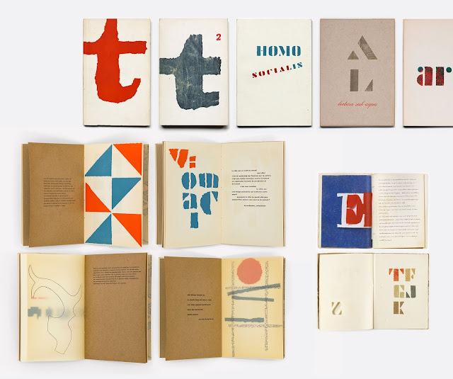
Willem Sandberg - Experimenta Typografica
Looked at the work of Willem Sandberg's pamphlet design in order to see how he combines text and image through the pages of the book.
Dynamic use of typography
Separates artwork and copy using the centre fold
Non of the pages are the same
Typesetting is inconsistent
Different stocks
The Unknown Citizen' by W. H. Auden
The fact that the artists' book originates through poetry and literature and Carrion's text provides a section on 'Prose and Poetry', I included a poem at the end of the text in order to demonstrate some of the experimental methods of typesetting that poetry promotes.
I chose to include Auden's 'The Unknown Citizen' because it is renowned for its wit and irony in complaining about the mundane and anonymous qualities of bureaucratic, semi-socialist Western societies. This relates to my research project as I discovered the artists' book was a liberating platform for people to express subconscious and thematic issues without commercial restraints and ultimately become the author of their own work.
The artists' book was also a reaction against the fine art establishment
Graphic designers turned to independent publishing to seek authorship
The painting of the blocks of text aims to emphasise alternative spaces.
Kept the cover minimal:
I haven't added any colour as I intend to print directly onto a coloured stock.
Page Compositions
Took advantage of digital design tools by cropping and layering compositions:
This demonstrates the benefits of digital design tools.
Willem Sandberg - Experimenta Typografica
Looked at the work of Willem Sandberg's pamphlet design in order to see how he combines text and image through the pages of the book.
Dynamic use of typography
Separates artwork and copy using the centre fold
Non of the pages are the same
Typesetting is inconsistent
Different stocks
The Unknown Citizen' by W. H. Auden
The fact that the artists' book originates through poetry and literature and Carrion's text provides a section on 'Prose and Poetry', I included a poem at the end of the text in order to demonstrate some of the experimental methods of typesetting that poetry promotes.
I chose to include Auden's 'The Unknown Citizen' because it is renowned for its wit and irony in complaining about the mundane and anonymous qualities of bureaucratic, semi-socialist Western societies. This relates to my research project as I discovered the artists' book was a liberating platform for people to express subconscious and thematic issues without commercial restraints and ultimately become the author of their own work.
The artists' book was also a reaction against the fine art establishment
Graphic designers turned to independent publishing to seek authorship
The painting of the blocks of text aims to emphasise alternative spaces.


No comments:
Post a Comment